Case Study · Well · March – April 2022
Accessible buttons that actually work for everyone.
Redesigning a core component system for contrast, text scaling, and multi-language support — with cleaner code underneath.

Role
UX/UI Designer
Timeline
Mar – Apr 2022
Team
Andrew Schwint · Colleen Curtis · Bernie Smigel
Tools
Figma
Overview
Toward the end of my co-op at Well, I was asked to redesign the app's selection buttons — the components users interact with during their health journey when answering questions about their condition. What looked like a small UI task turned into a real lesson in accessible component design: when color alone isn't enough, and how constraints lead you to cleaner solutions.
The problem
How do we design a reusable set that works across contrast levels, text sizes, and languages?
The start
Audit first. Design second.
The Audit
The PMs came in with a clear brief: consolidate the button types, fix the accessibility issues, and design all the selection screens. My first goal was to find what we could reuse — so developers wouldn't be handed a net-new component build when existing foundations could do the work.
Requirements
Research button types — tags vs. buttons, single vs. multi-select
Incorporate WCAG accessibility requirements
Review current components for reusable parts
Design all selection screens for the health journey flow
Design
Knowing when to kill your darlings.
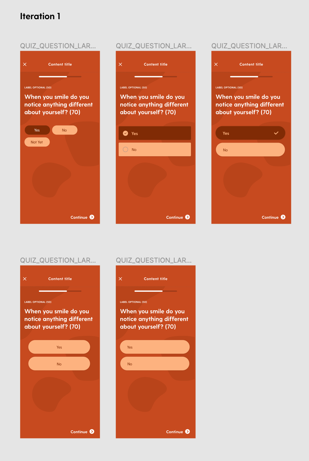
First Iterations
The original design had a colorful background. My first instinct was to try to save it — to keep the visual personality of the existing experience while fixing the accessibility problems on top of it. I explored multiple selection styles and button types within that constraint.
It didn't work. WCAG requires at least two distinct indicators of selection — not just color. The colorful background was fighting that requirement at every turn.
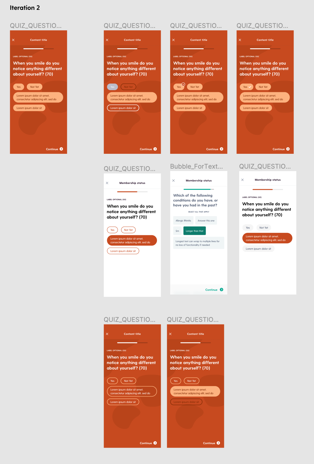
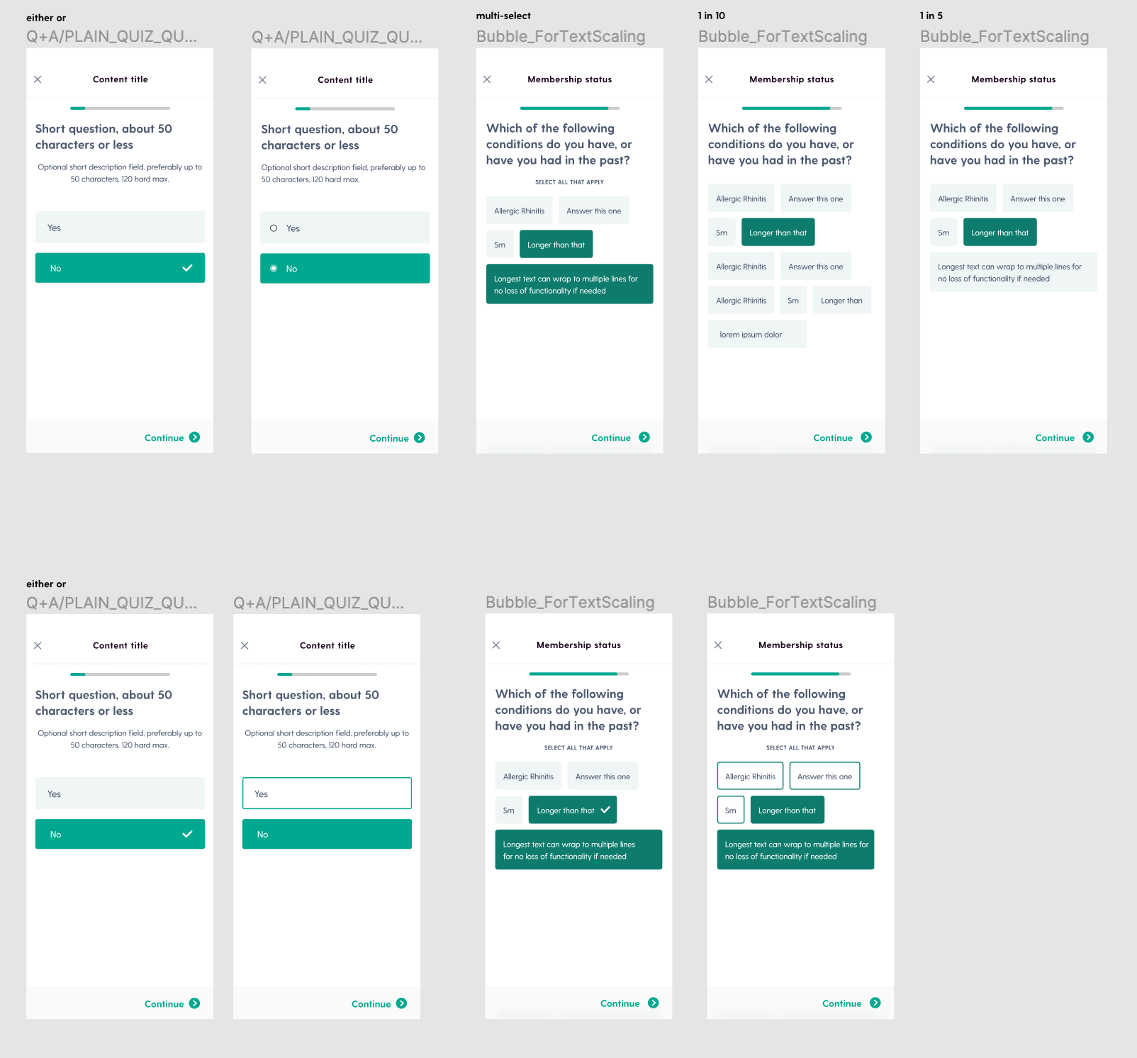
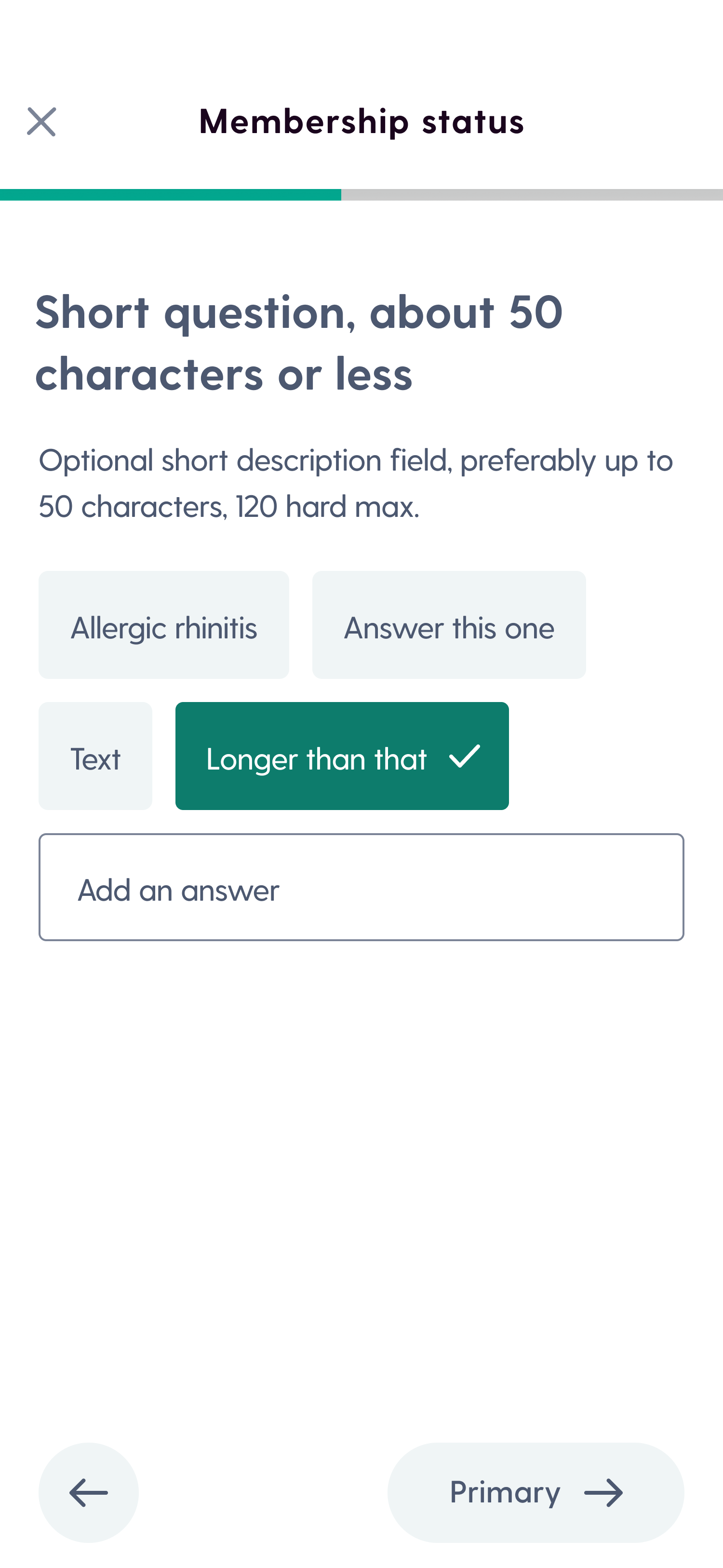
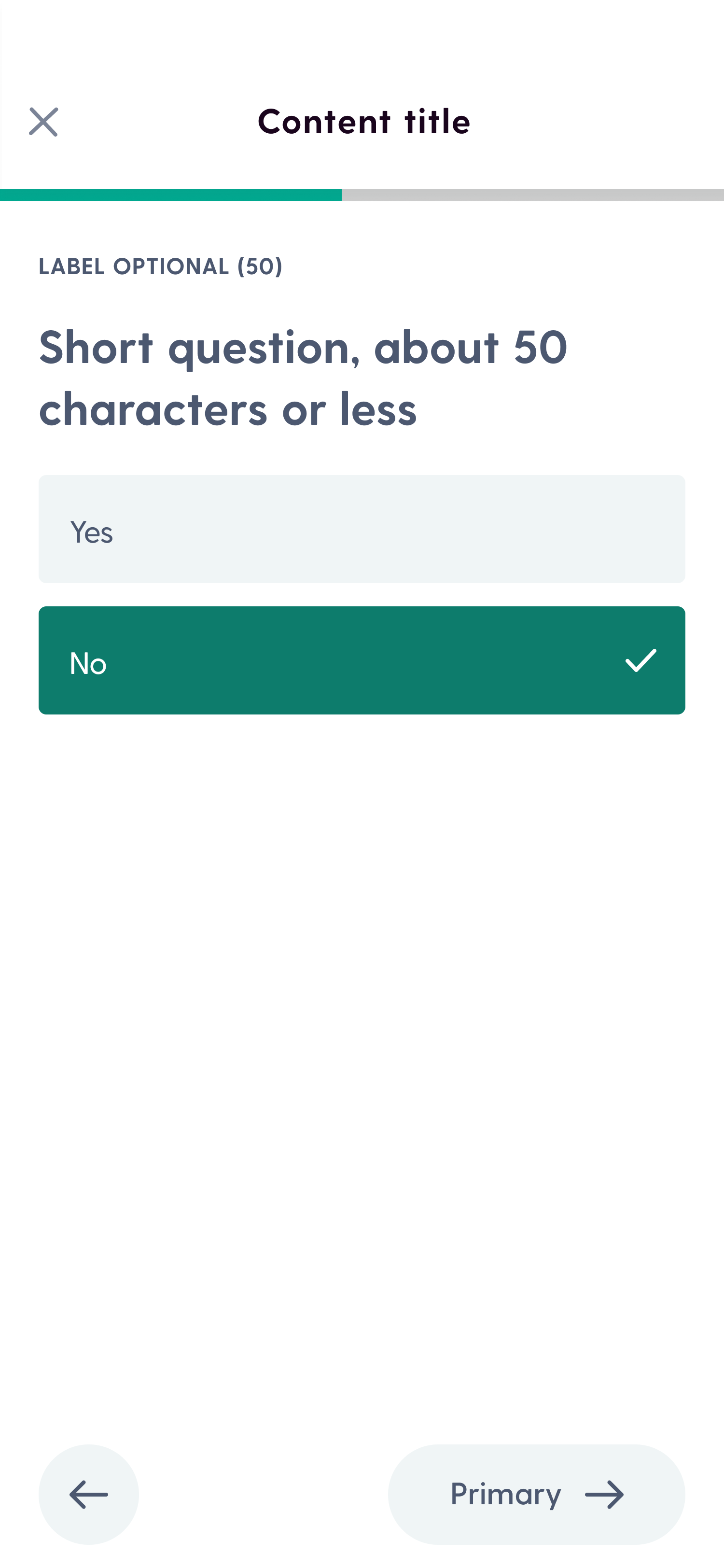
The Final Design
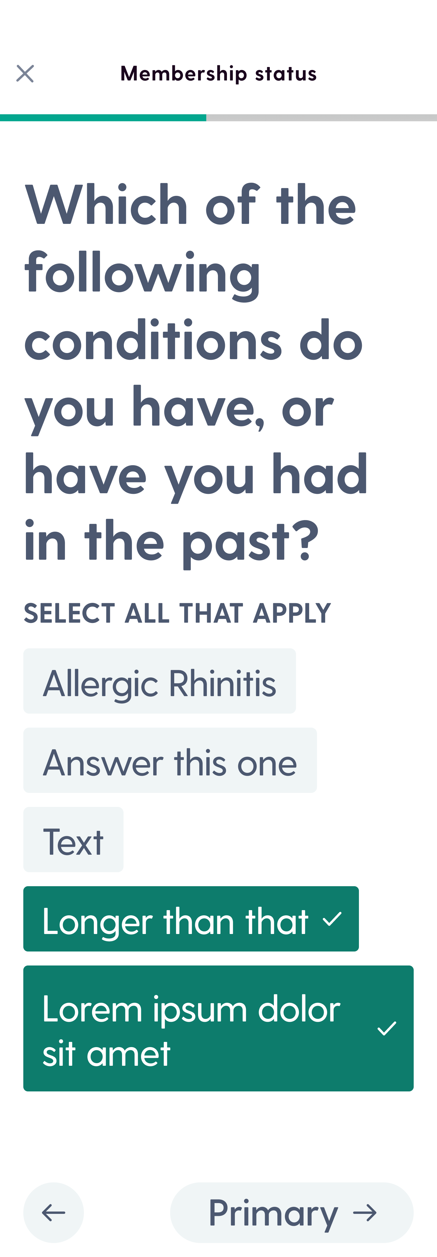
I dropped the colorful background. Clean white background, clear selection states using both color and shape — two distinct indicators, as required. The button design was inspired by an existing component in the library, which meant developers already had a foundation to build from. The detail that unlocked the whole thing: a small label above each button group clarifying the question context. Tiny, but it made the interaction significantly clearer.
Accessibility Test
Final designs were tested for contrast ratios, text scaling, and multi-language support — the three failure modes of the original. All passed.
The button system shipped and was added to Well's component library, where it became the standard for all selection screens across the health journey flow. The lesson I took from it: accessible design isn't a checklist you run at the end. It's a forcing function.