Case Study · Well · February – April 2022
A sign-up experience that makes users want to download.
Multi-month project spanning illustration, responsive design, and real lessons in designing within business constraints.

Role
UX/UI Designer · Illustrator
Timeline
Feb – Apr 2022
Team
Andrew Schwint · Colleen Curtis · Sebastian Vergara
Tools
Figma · Jira · Confluence
Overview
This was the first project I worked on at Well — and it set the tone for how I'd approach the rest of my co-op. Product managers wanted a web-based sign-up flow to increase engagement and reach users who hadn't yet downloaded the app. What started as ‘turn these wireframes into hi-fi designs’ quickly became a multi-month project spanning illustration, responsive design, and some real lessons in designing within business constraints.
Where it started
How do we create a sign-up that doesn't require downloading the app — and actually makes users want to?
The Problem
Product managers at Well wanted a web-based path to sign-up — a way to reach users who hadn't yet downloaded the app and convert them without requiring an install first.
Dissecting the brief
Lo-fi wireframes, a clear flow, and one open-ended brief.
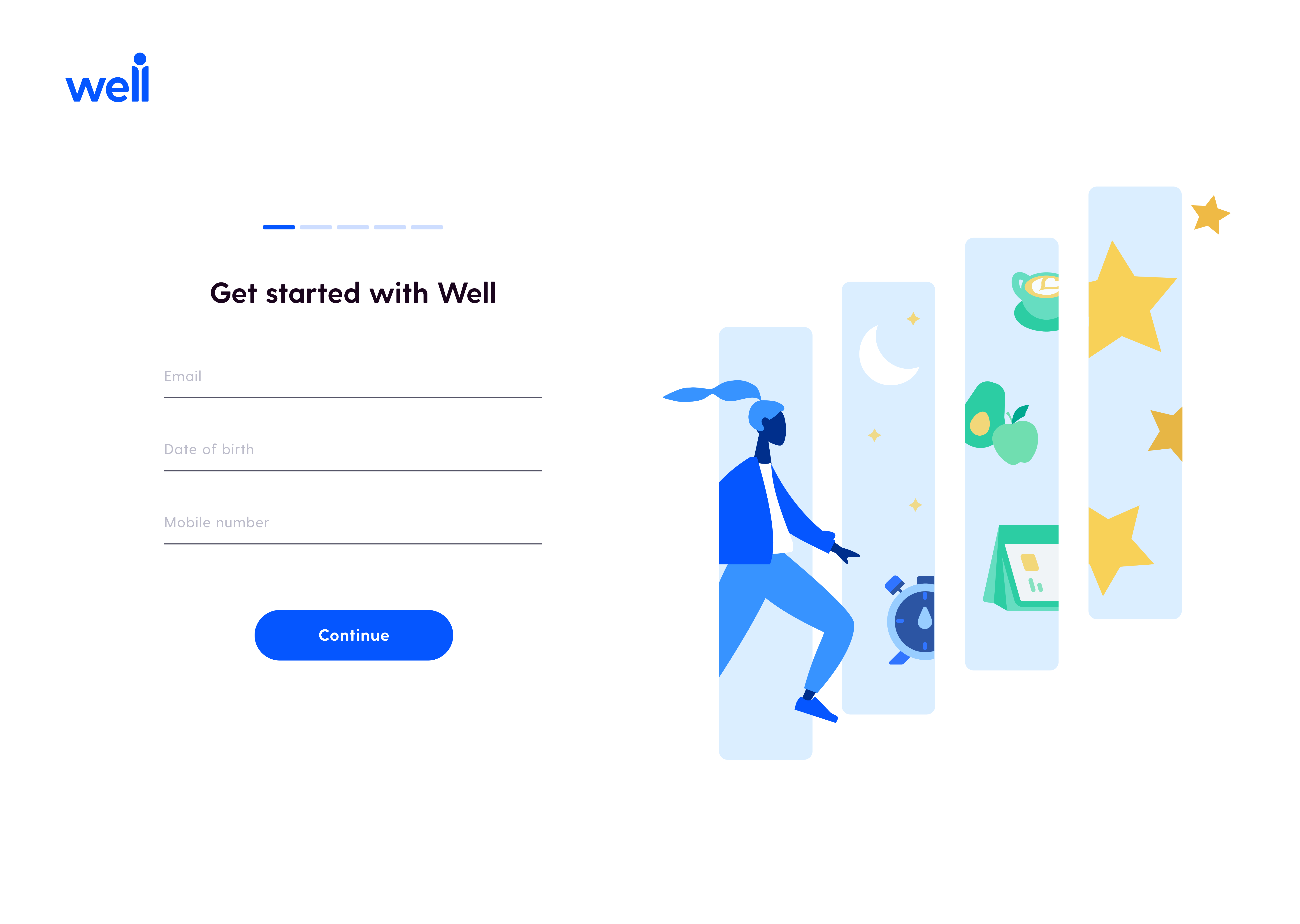
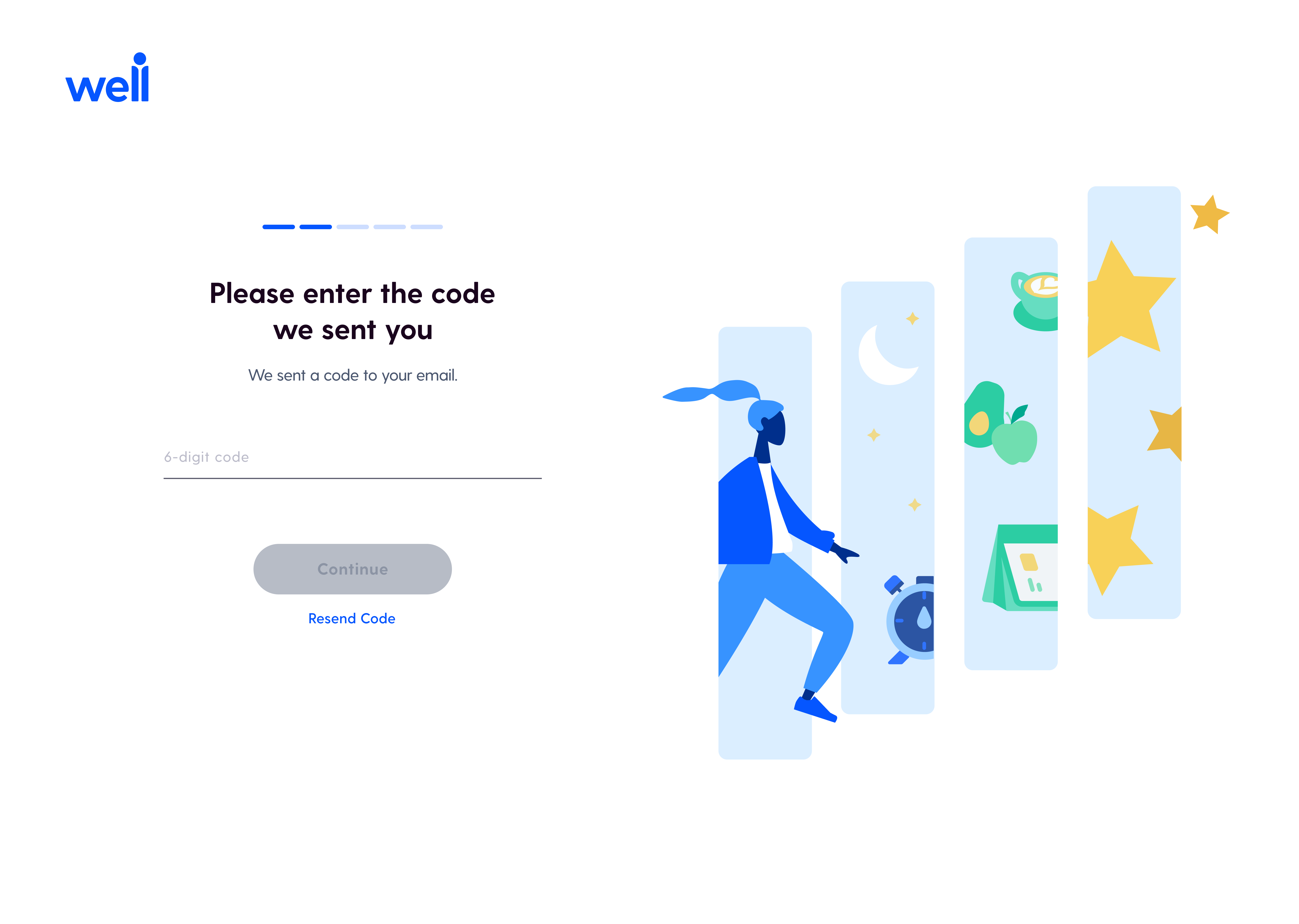
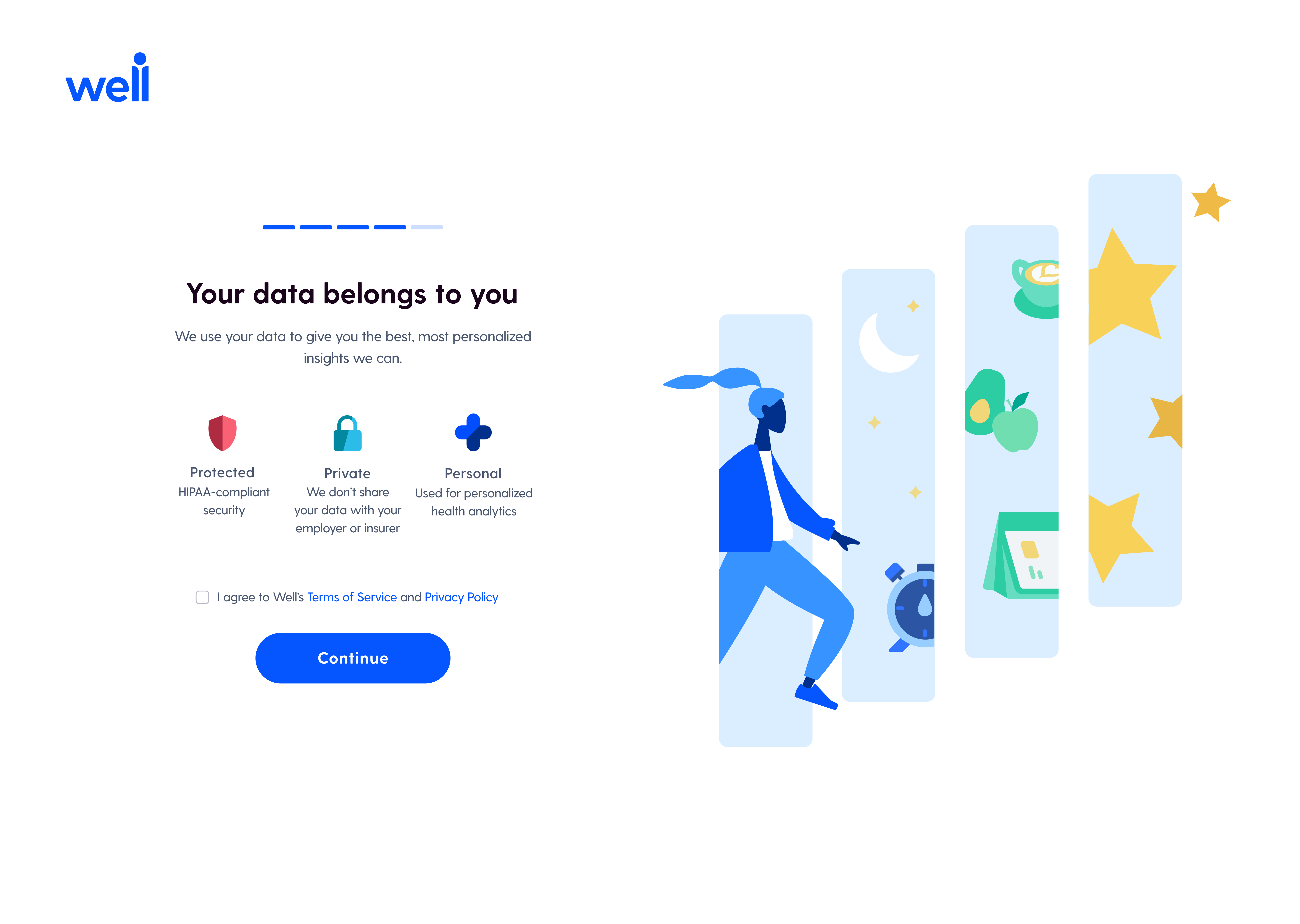
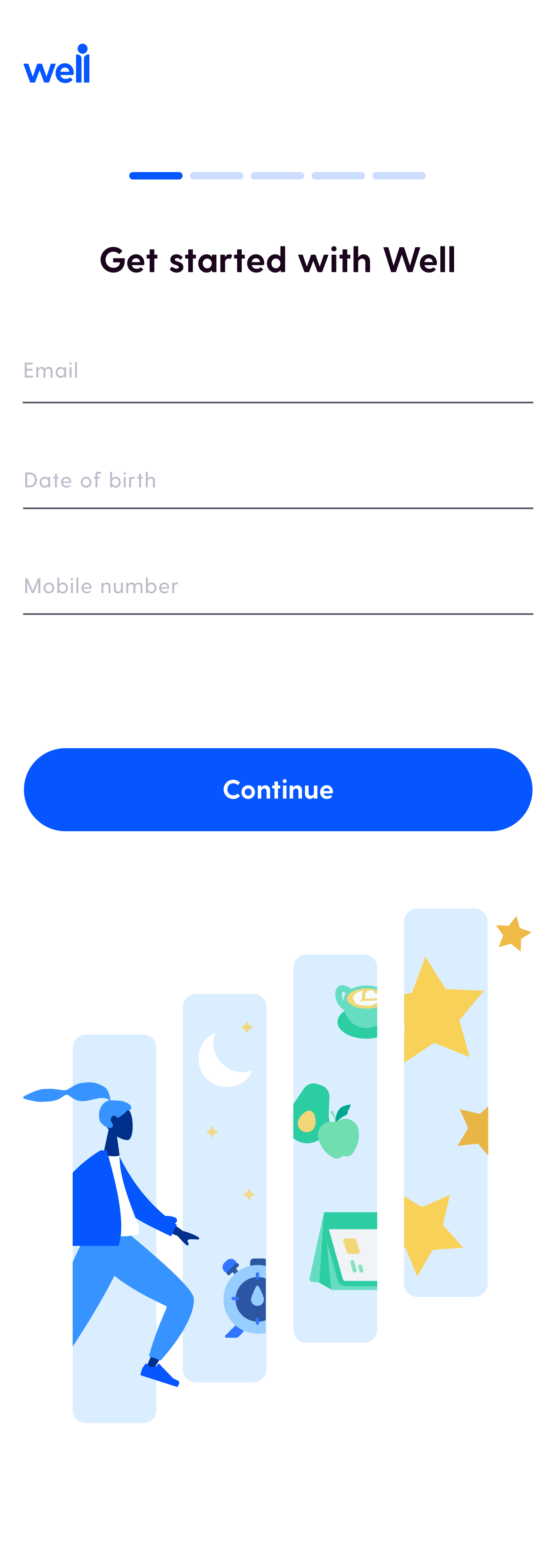
The Brief
The PMs came in with lo-fi wireframes and a defined flow. My job was to translate those into production-ready hi-fi designs and work directly with developers on what was technically feasible.
Requirements
Translate lo-fi PM wireframes into hi-fi designs
Mirror the mobile app sign-up process with minimal steps
Create an original illustration that embodies Well's mission
Teaching myself
Responsive design — documented for the whole team.
Responsive Design
This was my first time designing for responsive breakpoints. Rather than just figuring it out as I went, I spent time doing extensive research on breakpoint systems and responsive design principles — then documented everything I learned in Confluence for the broader design team's library.
The craft
A month of illustration, iteration, and storytelling.
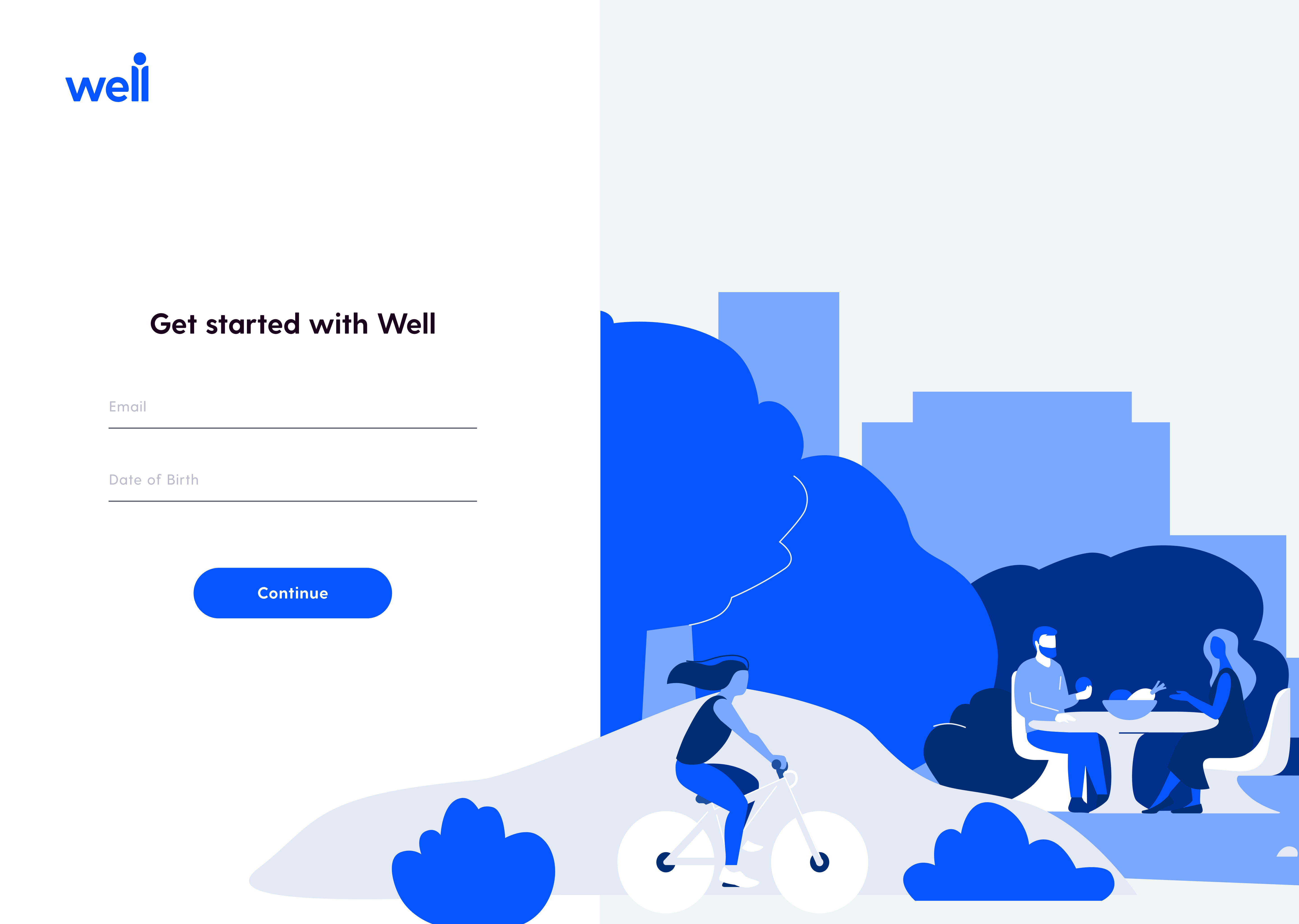
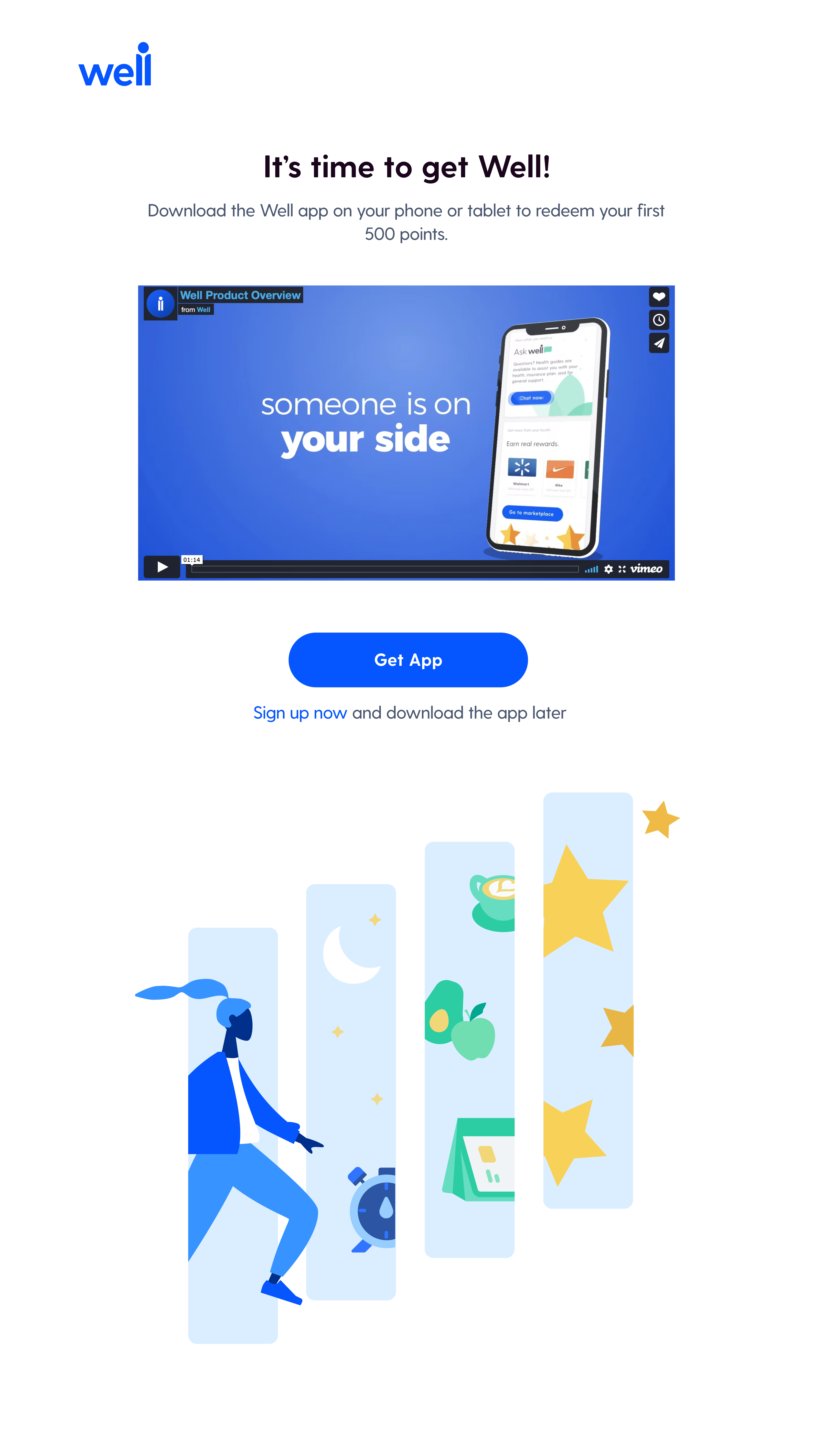
The Illustration
The brief asked for something that ‘embodies Well's mission, an open-ended prompt that allowed me to explore creatively.
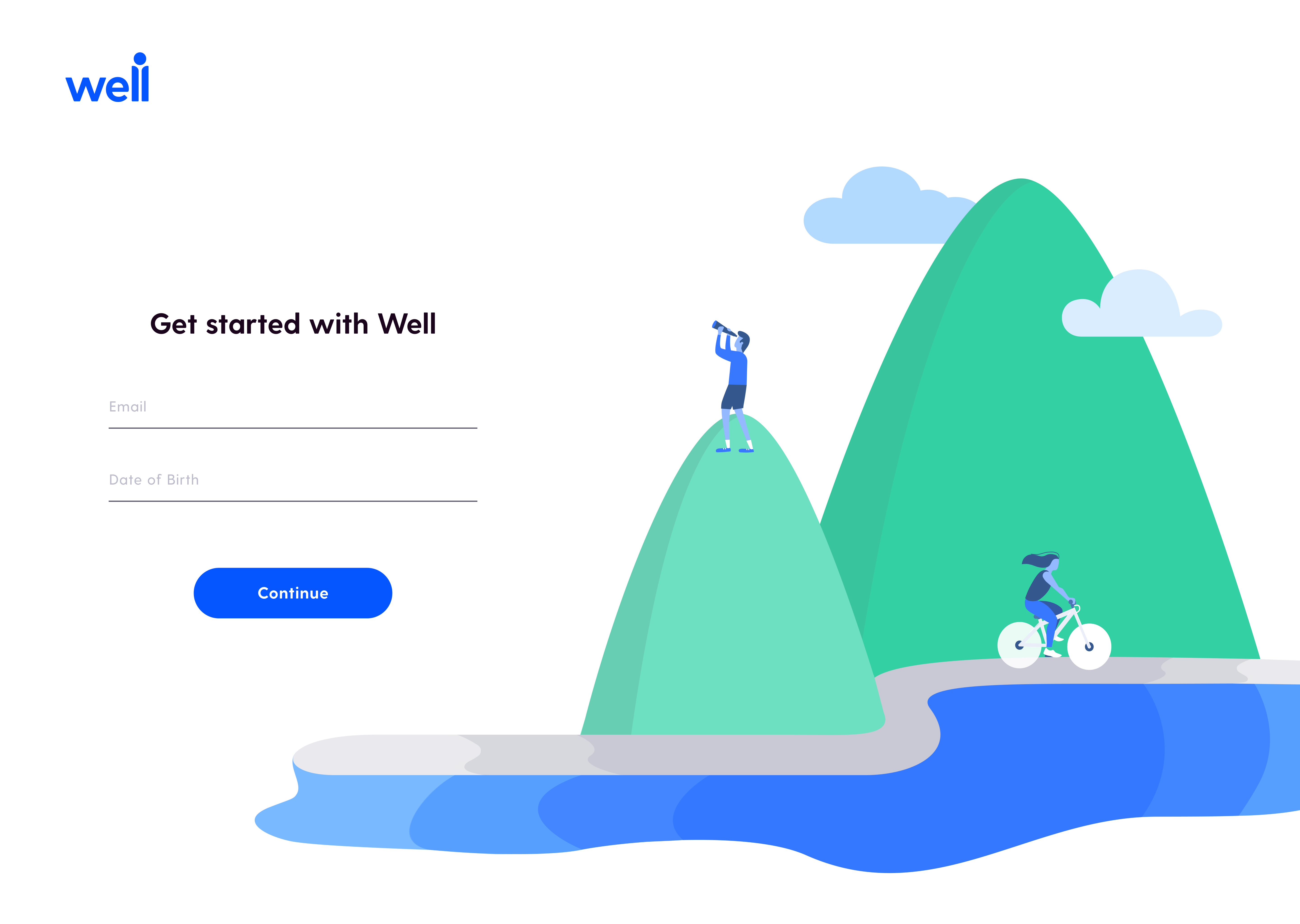
I spent a full month creating, testing, and iterating on the illustration before my team and I were satisfied. The final design tells the story of a user moving forward through their health journey — stepping through a series of panels, each representing a different dimension of wellbeing: sleep, nutrition, habits, rewards. The figure moves through them with momentum, forward-facing, progressing toward their goals.
Illustration Iterations
Final illustration
Design reality
Good design isn't always the most elegant solution.
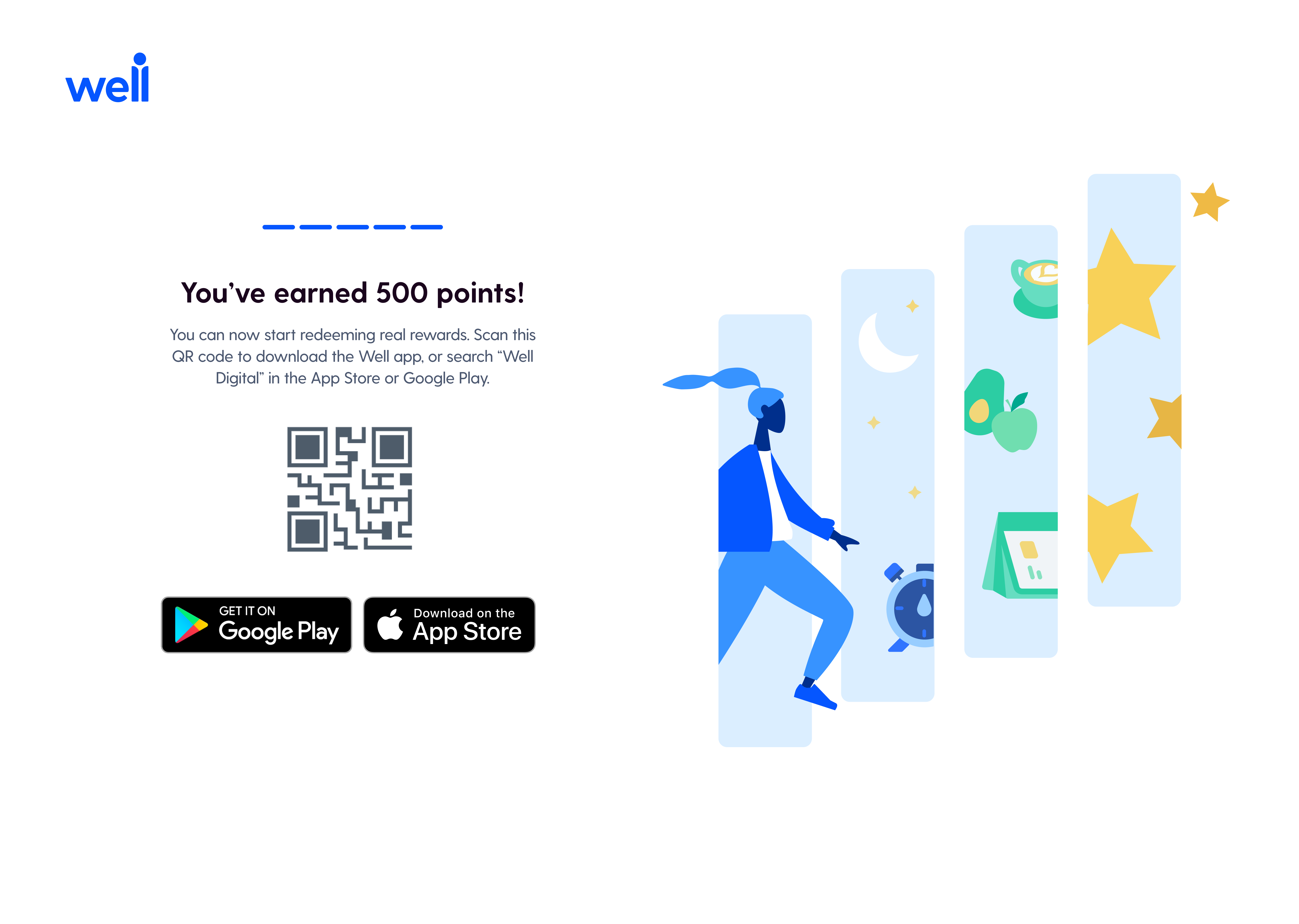
Context
Over two months I was in constant conversation with PMs, developers, and the design team about what we could actually build. The biggest tension point: how do users get from the web onboarding to the app?
The Tension
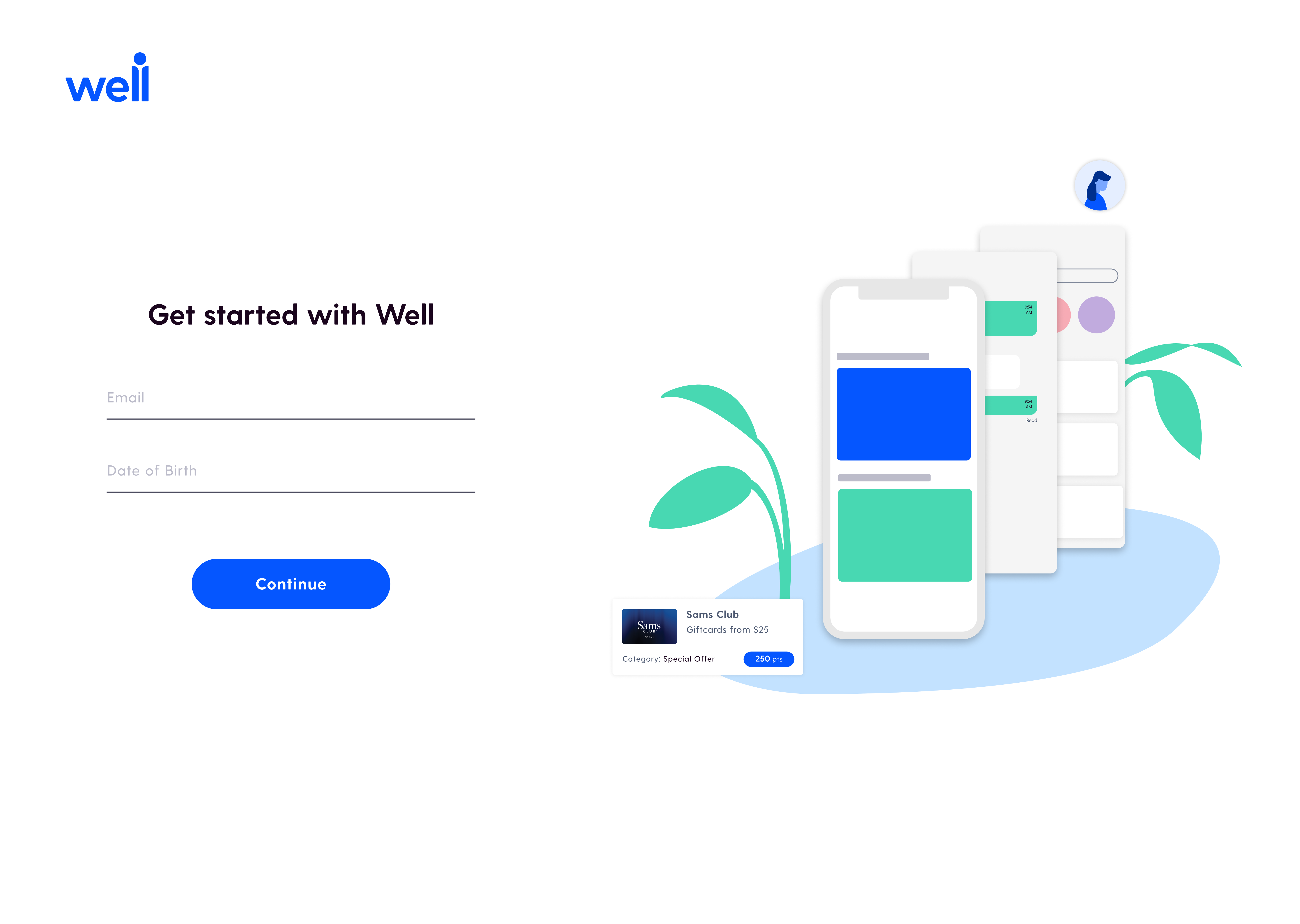
The ideal solution would have been a mobile deep link — tap a button, open the app. But that technology hadn't been developed yet, and there were security constraints that ruled it out. I explored a few alternatives before landing on the QR code approach the PMs had proposed. It wasn't my first choice aesthetically, but it was the right call given the constraints — it kept users from getting stuck on web without requiring infrastructure we didn't have.
Final output
Desktop, tablet, and mobile — fully responsive.
Deliverables
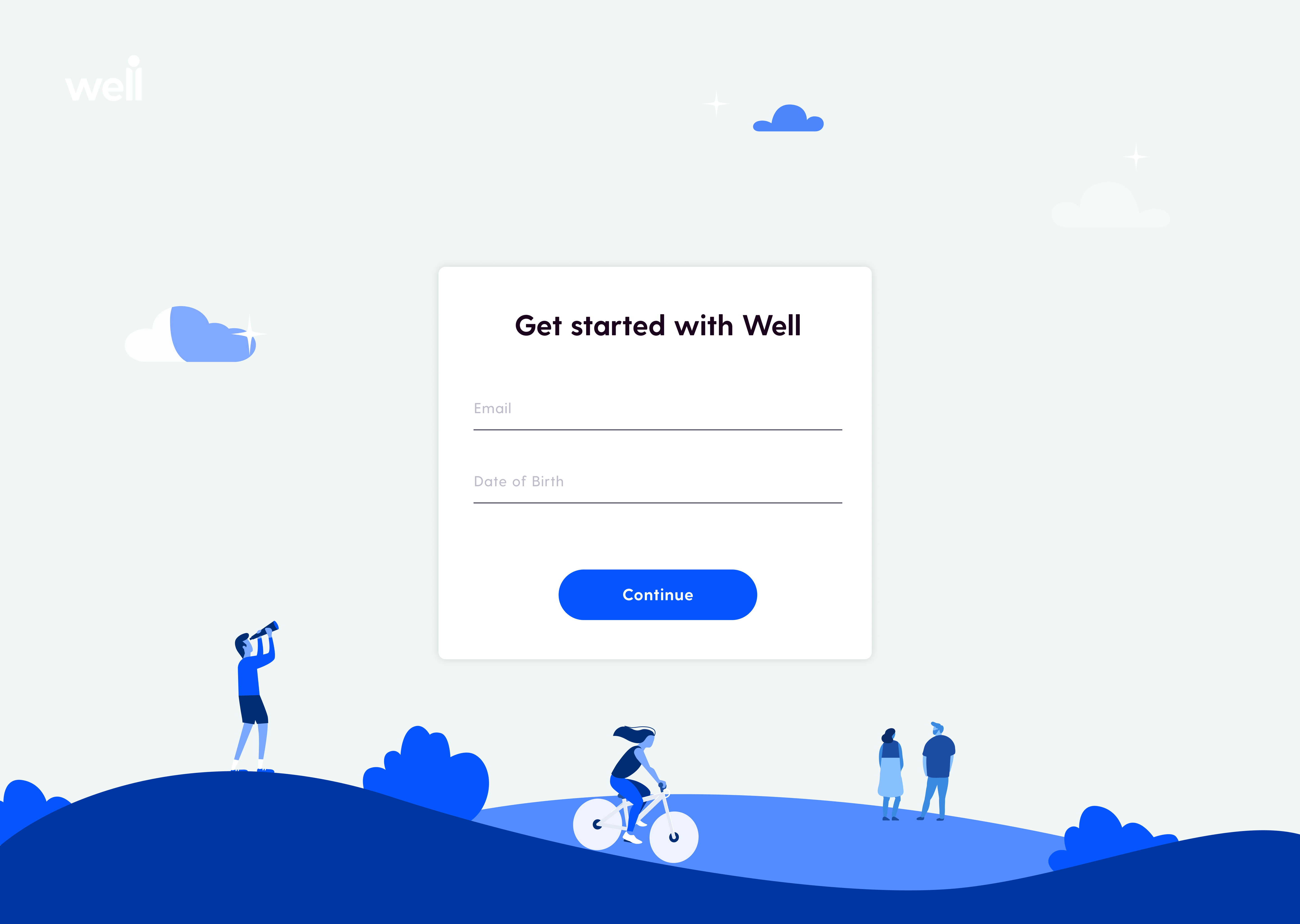
I delivered fully responsive designs across three breakpoints — desktop, tablet (iPad Pro 11”), and mobile (iPhone X) — along with the final illustration.
Desktop
iPad
Mobile
The web onboarding shipped and was received positively. The QR code was realized as a supplement to the Google and Apple app download buttons. The team was able to collect 1.5x more sign-ups in a quick and efficient way without users even needing to log into the app.