Case Study · Pasito · June 2021 – December 2022
Taking Pasito's first product from sketches to validated prototype.
From early sketches to a validated, clickable prototype — research, workshops, and 20+ user interviews that shaped every design decision.

Role
UX/UI Designer · User Researcher
Timeline
Jun 2021 – Dec 2022
Team
Pauline Roteta · Julie Scotland · Angela Lin
Tools
Figma · Miro
Overview
This was my largest undertaking at Pasito. From June 2021 through December 2022, I was the sole designer taking their first product from a few rough sketches to a validated, clickable prototype — running research, leading user testing, and iterating through two dashboards. I didn't just design the product. I helped build the design practice from the ground up.
The problem
Employees can't access benefits they don't understand. Employers lose money when those benefits go unused.
The Problem
Employees struggle to understand their benefits — what they're entitled to, what saves them money, and how to actually access it through their company. Employers lose money on taxes when benefits go unused. How do we build a product that bridges that gap for both sides?
Research
Introducing design thinking to a startup.
Research
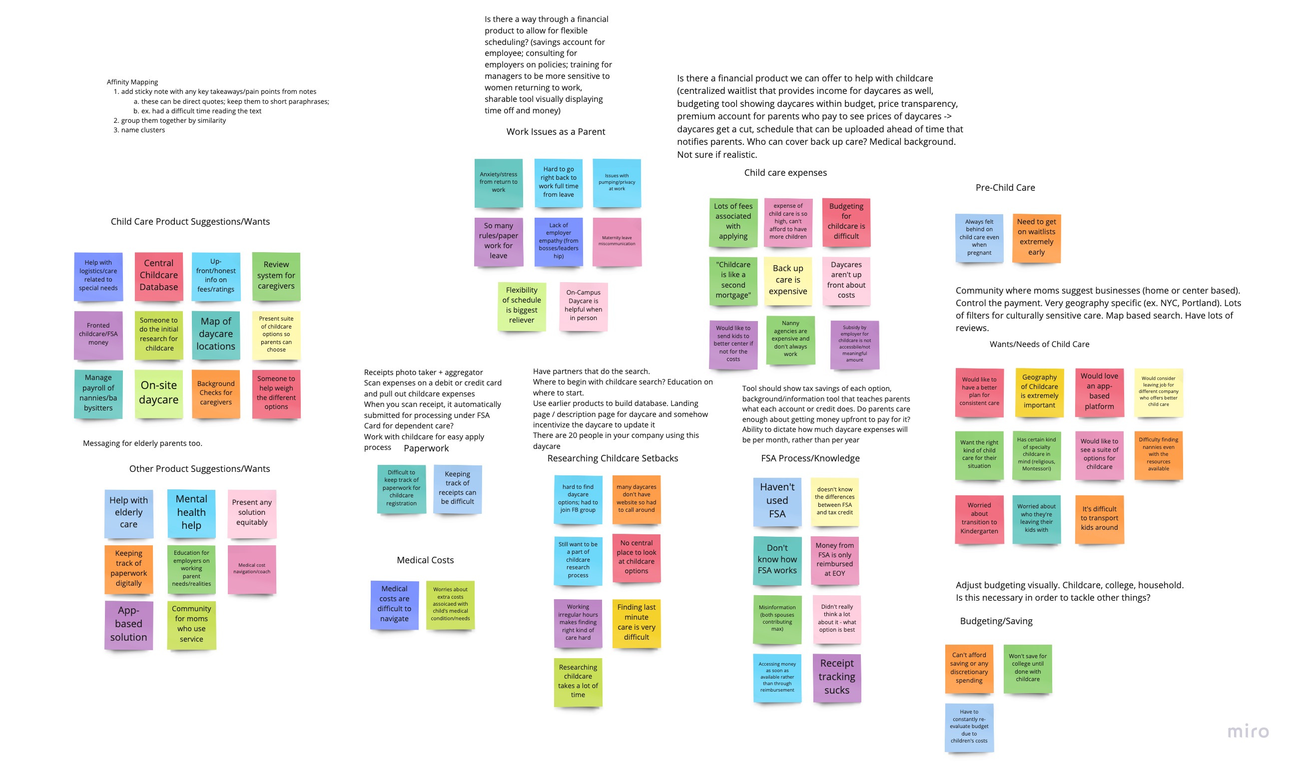
Pauline and Julie were business-minded founders who hadn't worked with a designer before. One of my first contributions wasn't a design — it was introducing them to a design process. I ran a series of workshops to help the team ideate together: affinity mapping, crazy 8s, and feedback synthesis from marketing validation interviews with working parents. What came out of those sessions was a shared understanding of what the product actually needed to be — not just what the founders had imagined, but what users were asking for.
Ideation
Mapping the experience.
Ideation
With a clearer picture of the product, we developed user flows for the core experience: a question flow that would collect information from employees upfront, and the dashboard they'd land on after. I mapped out a site map and sketched the structure before moving into Figma.
Design
From lo-fi to clickable prototype.
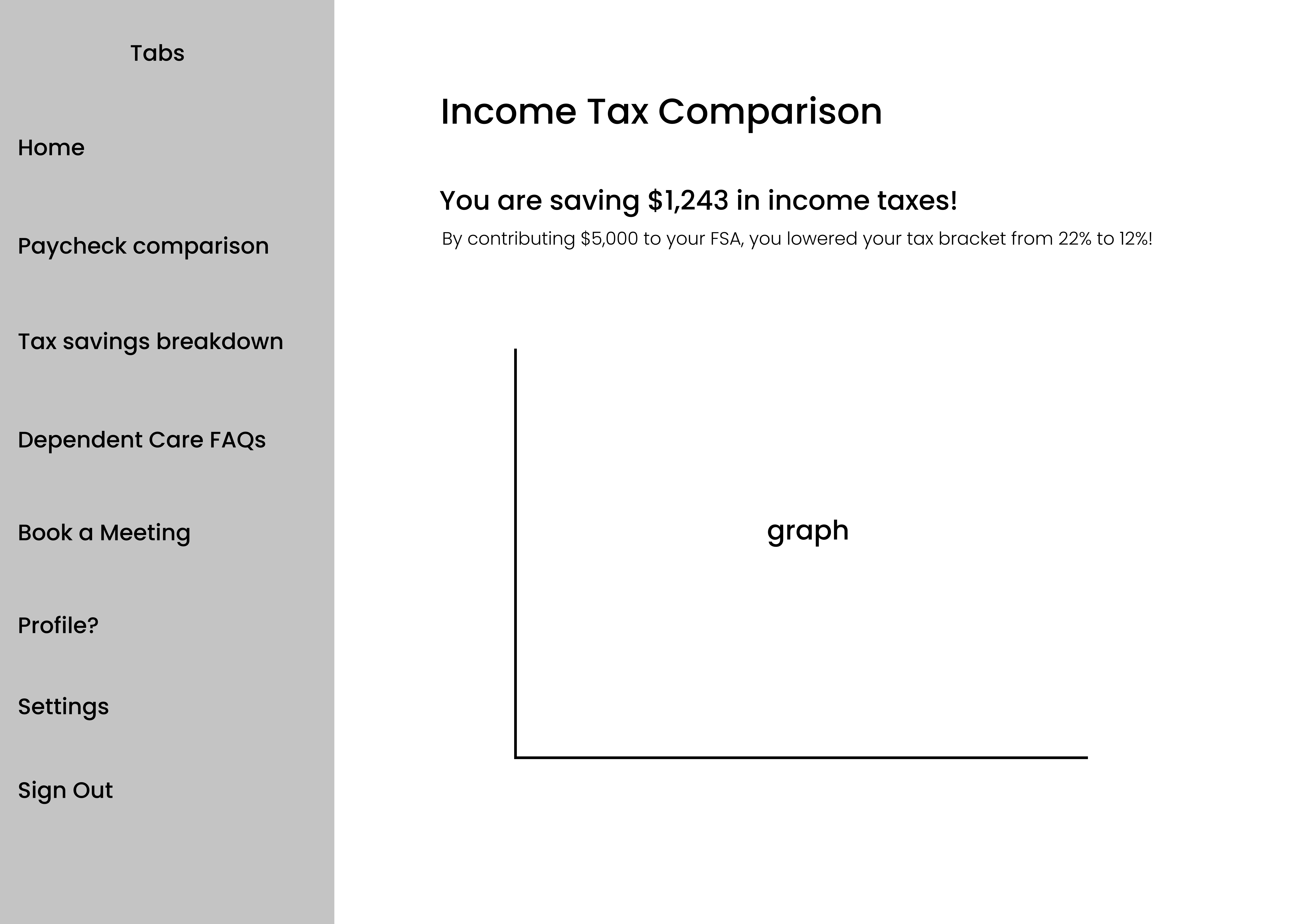
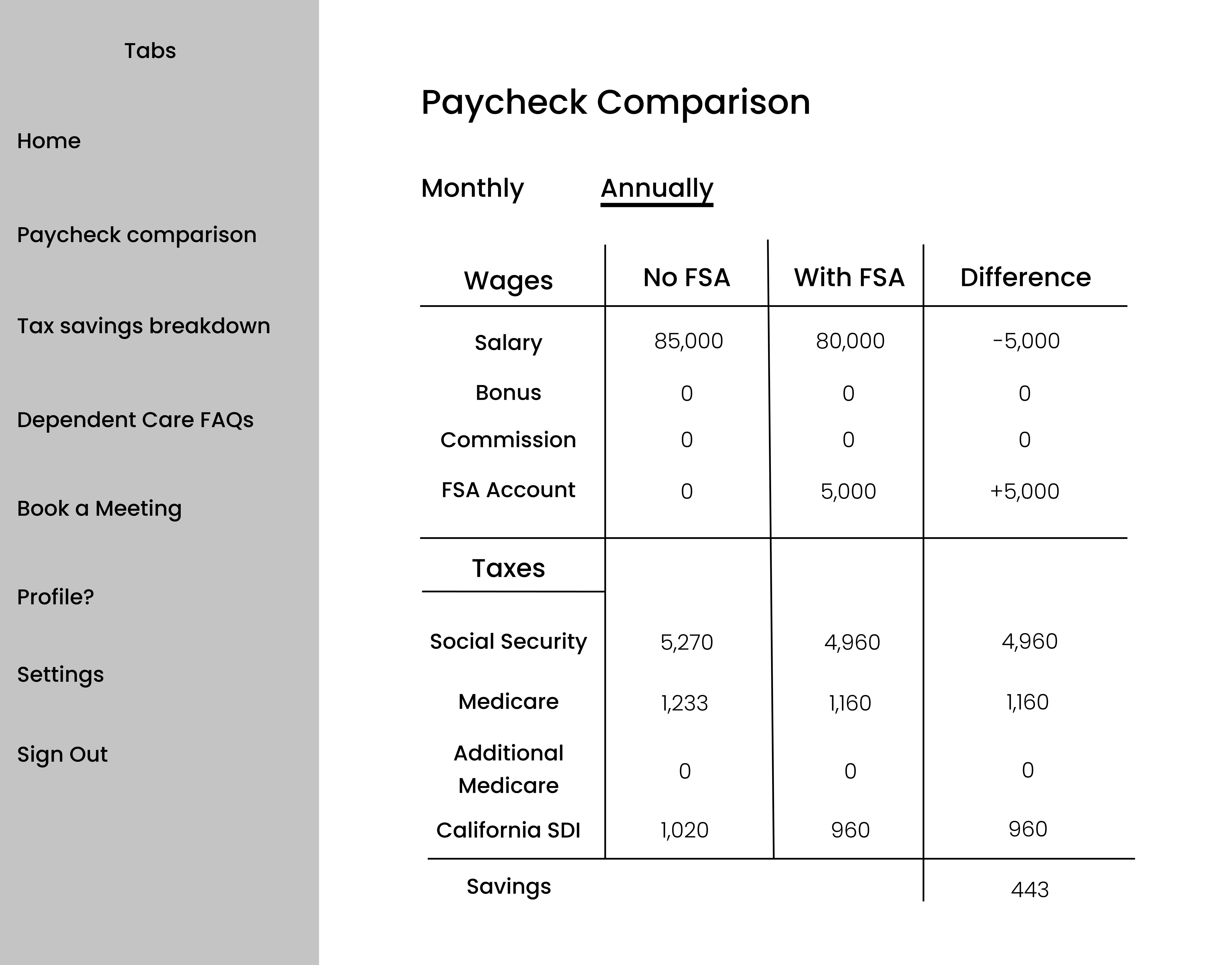
Lo-Fi Prototype
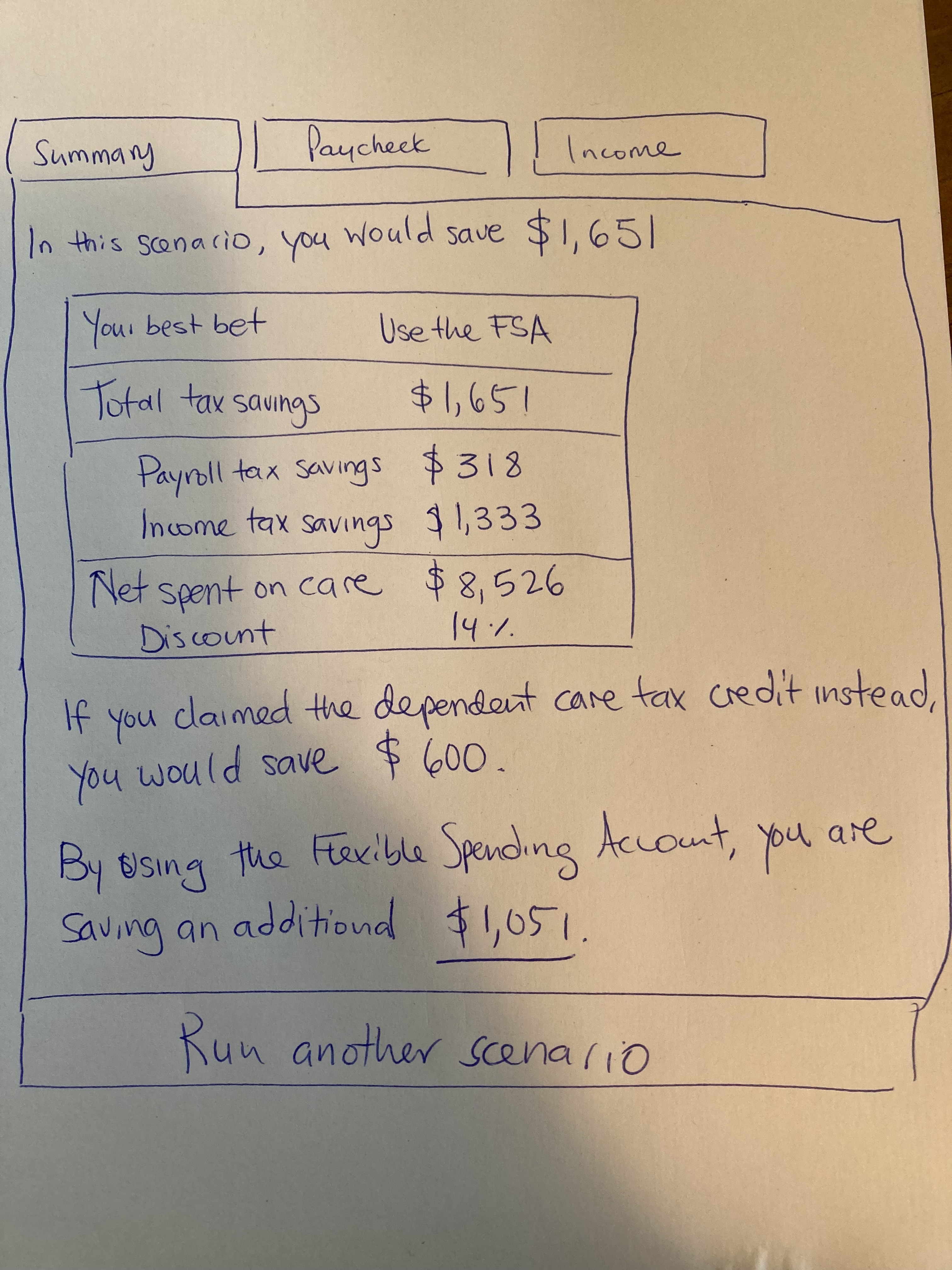
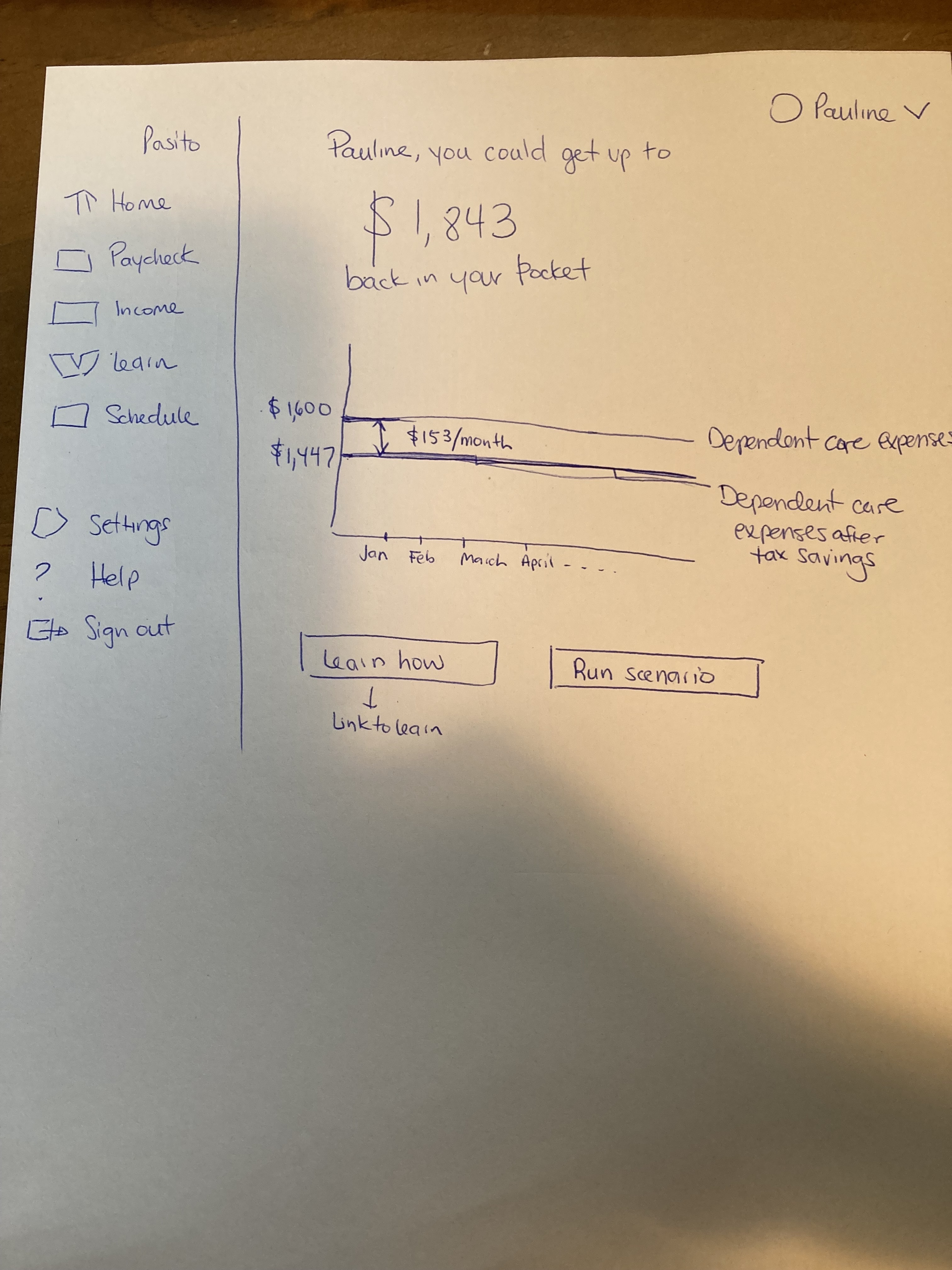
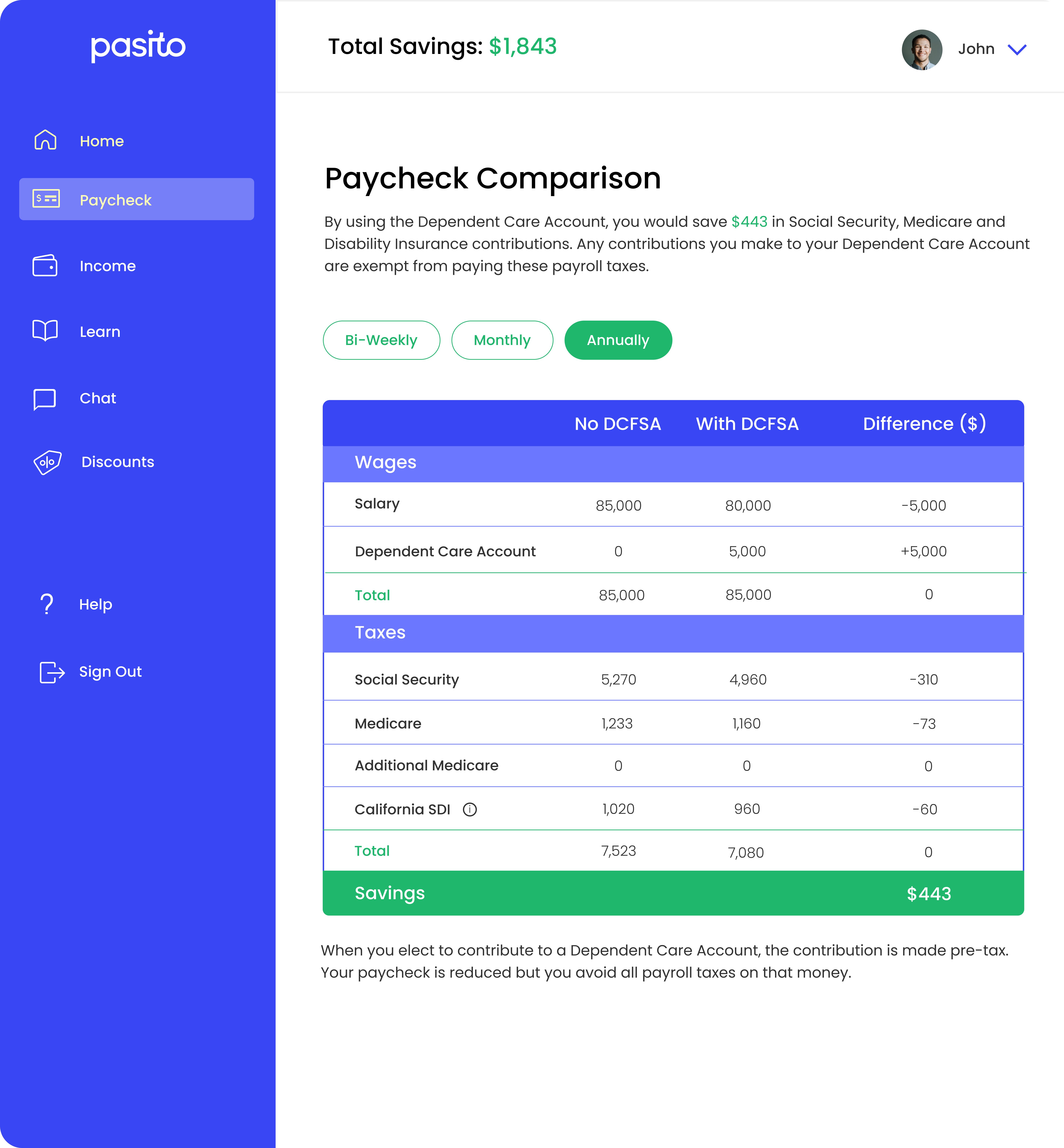
I built the lo-fi prototype first, working through the core screens: the onboarding question flow, paycheck comparison, income tax comparison, the learn tab, and the employee dashboard. The design principle throughout: make complex financial information feel approachable. The product was asking people to understand FSAs, dependent care tax credits, and paycheck breakdowns — none of which are intuitive. The design had to do real work.
User testing
20+ interviews. One defining insight.
User Testing
After developing the initial prototype, I led over 20 user testing interviews with working parents over Google Meet. The biggest finding: employees found it genuinely hard to figure out which benefits were best for their situation — largely because benefits information at most companies is disorganized and hard to parse. That insight directly shaped how we redesigned the learn tab and paycheck comparison breakdowns in subsequent iterations.
Hi-fi design
From lo-fi to polished product.
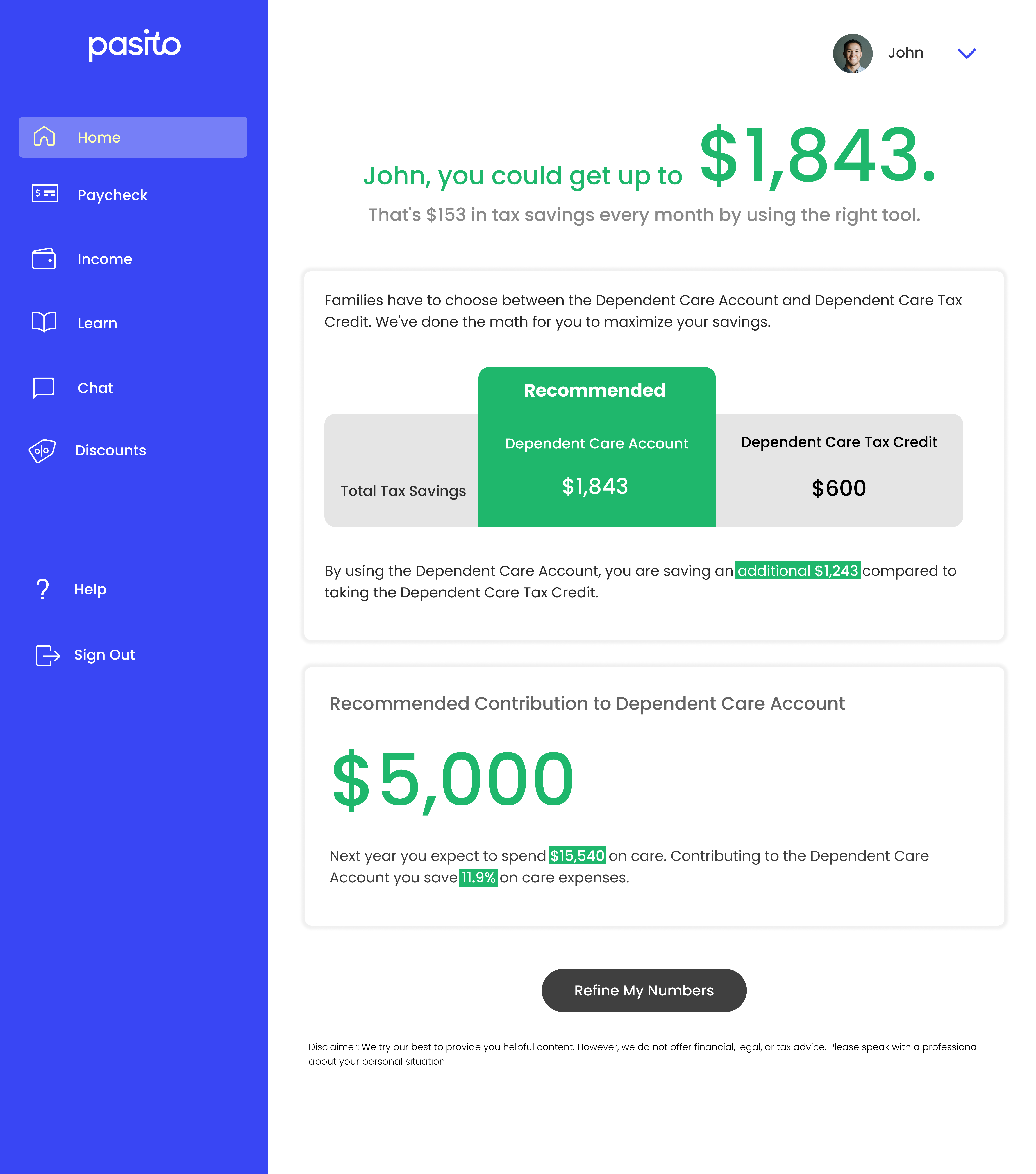
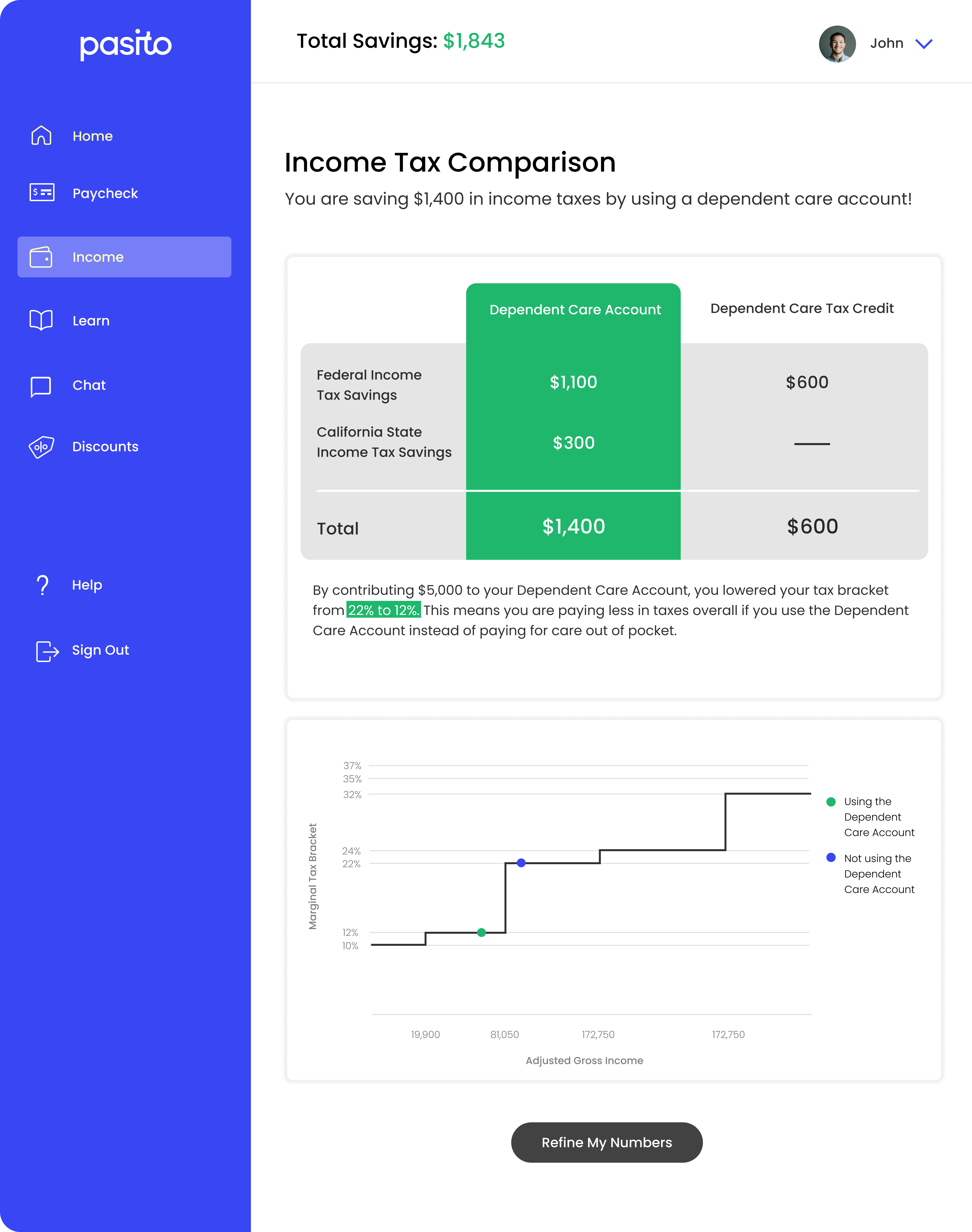
Hi-Fi Screens
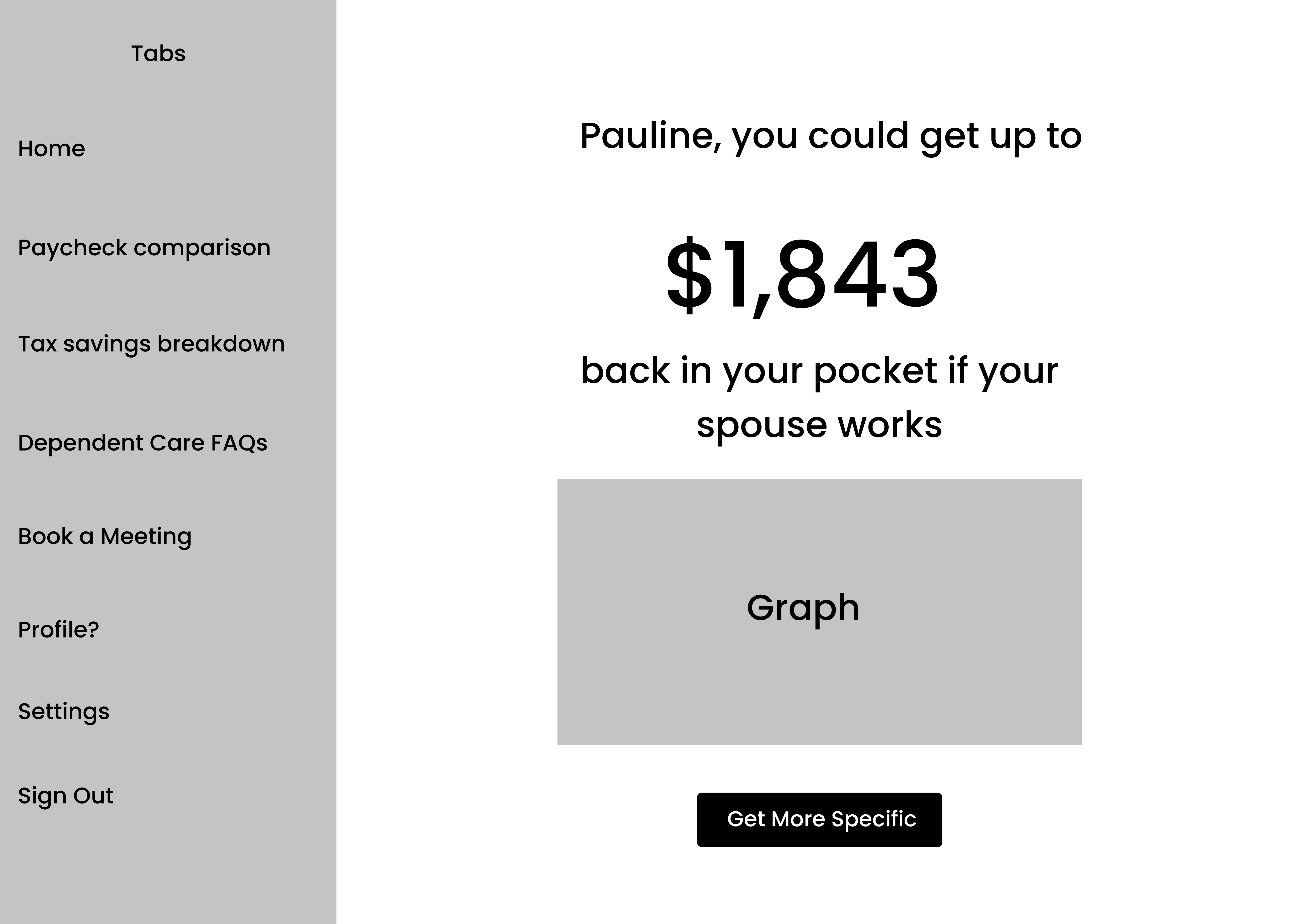
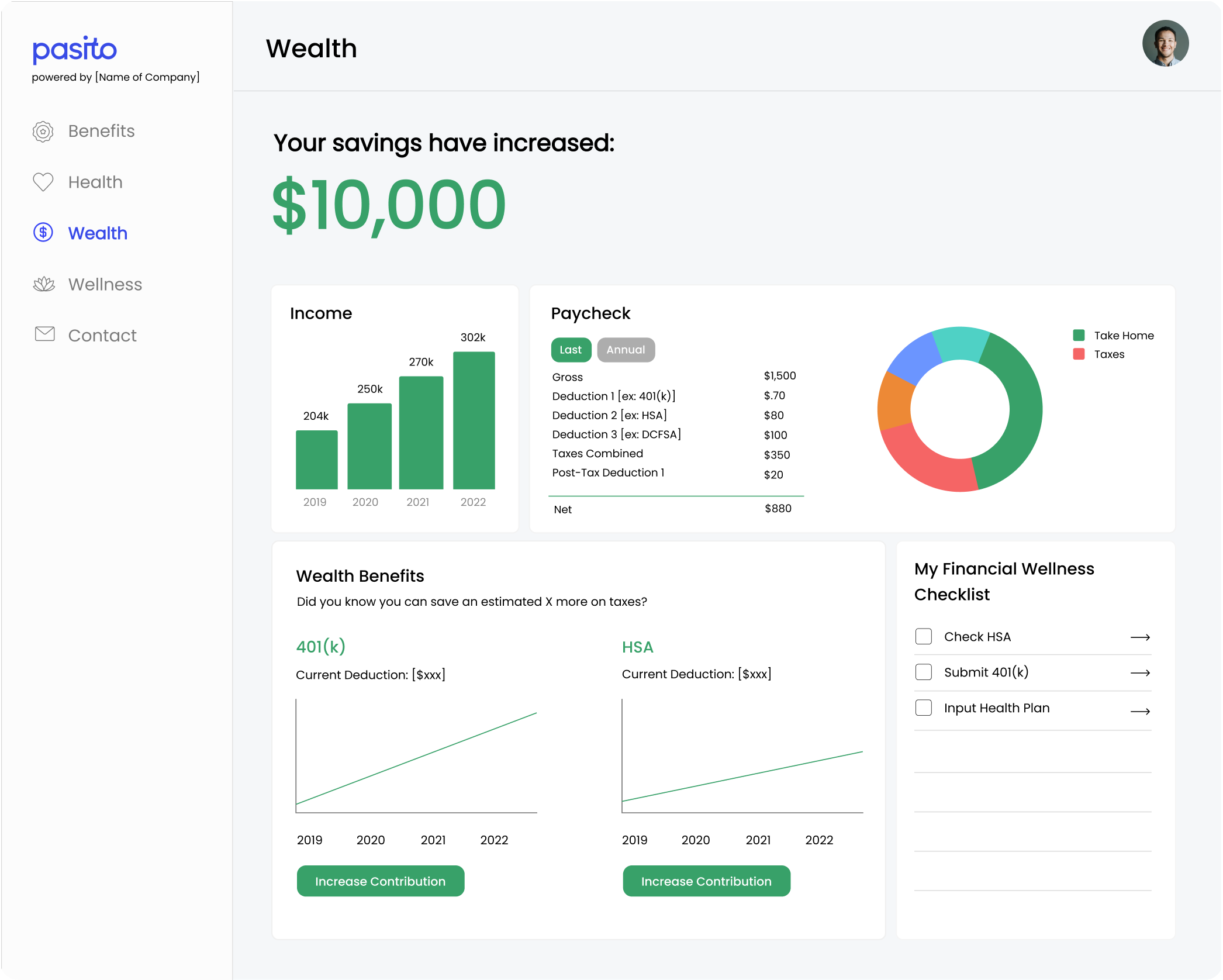
With user testing insights incorporated, I moved the employee dashboard into hi-fi. The visual system prioritized clarity over density — progressive disclosure of complex financial data, a consistent card-based layout, and a color system that flagged recommended actions without overwhelming users. Every screen was designed to answer one question at a glance: what should I do next?
2022 update
When the product pivots, you pivot with it.
2022 Update
After YCombinator in 2022, Pasito shifted from a tax-focused tool to a broader HR communications platform — integrating payroll, financial, and claims data to optimize employee benefits coverage and utilization. The mission evolved, and so did the design. I redesigned the product to match the new direction: updated visual language, restructured information architecture, and new hi-fi mockups for the expanded product scope.
Taking a product from sketches to a validated prototype — with real users, real feedback, and a real pivot in the business along the way — taught me that good design at a startup means staying close to the problem even as it changes. The MVP I shipped wasn't the final product. It was the proof that there was one worth building.