Case Study · Copley · 2024–2025
Designing AI onboarding for people who don't trust AI.
Copley is an AI-heavy marketing platform built for DTC brands. The challenge wasn't teaching users how to use the product — it was getting them to believe it was worth trusting in the first place.

Role
Product Designer
Timeline
2025–2026
Team
Angela Lin · Mike Torra (CTO) · David Henriquez (CEO)
Tools
Figma
Overview
Copley's core product is powerful — it analyzes store data, surfaces high-impact creative opportunities, and uses an AI agent to take users from brief to production-ready ad variants in minutes. But we had a problem: the people who needed it most were the least likely to trust it.
DTC marketers are skeptical of AI tools by default. They've seen bad output, they worry about losing creative control, and they don't want to feel like they're being replaced. The existing onboarding put users through a form-heavy sign-up before showing them a single pixel of value — and dropped them into a blank dashboard with no guidance.
My job was to design an experience that built trust before it asked for it.
The problem
Three fears standing between users and value.
Three Fears
Before designing anything, I needed to understand what was actually holding AI-hesitant users back. Through user interviews and behavioral analysis, three distinct fears emerged — and they required completely different design responses.
Users don't need to be convinced AI is good. They need to feel in control while it's working.
The approach
Value before commitment. Show before tell.
The Approach
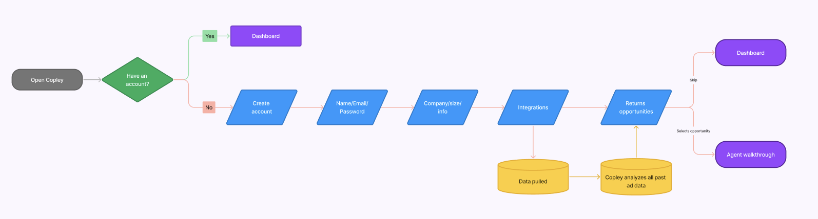
The original onboarding asked users to commit — name, email, company info, integrations — before showing them a single thing Copley could do. For an AI-hesitant user, that's asking for trust they haven't earned yet.
I flipped the logic entirely. The new flow shows value first, earns trust through transparency, then asks for commitment. By the time a user reaches the sign-up form, they've already seen a real insight from their own data. Sign-up becomes confirmation, not a blind leap.
Key design decisions
Three decisions that changed the outcome.
Decision 01 — The Insight Card
The original onboarding was a standard collection form — name, email, company info, integrations — that deposited users onto a blank dashboard with nothing to show for it. There was no signal that Copley had done anything with what they'd shared.
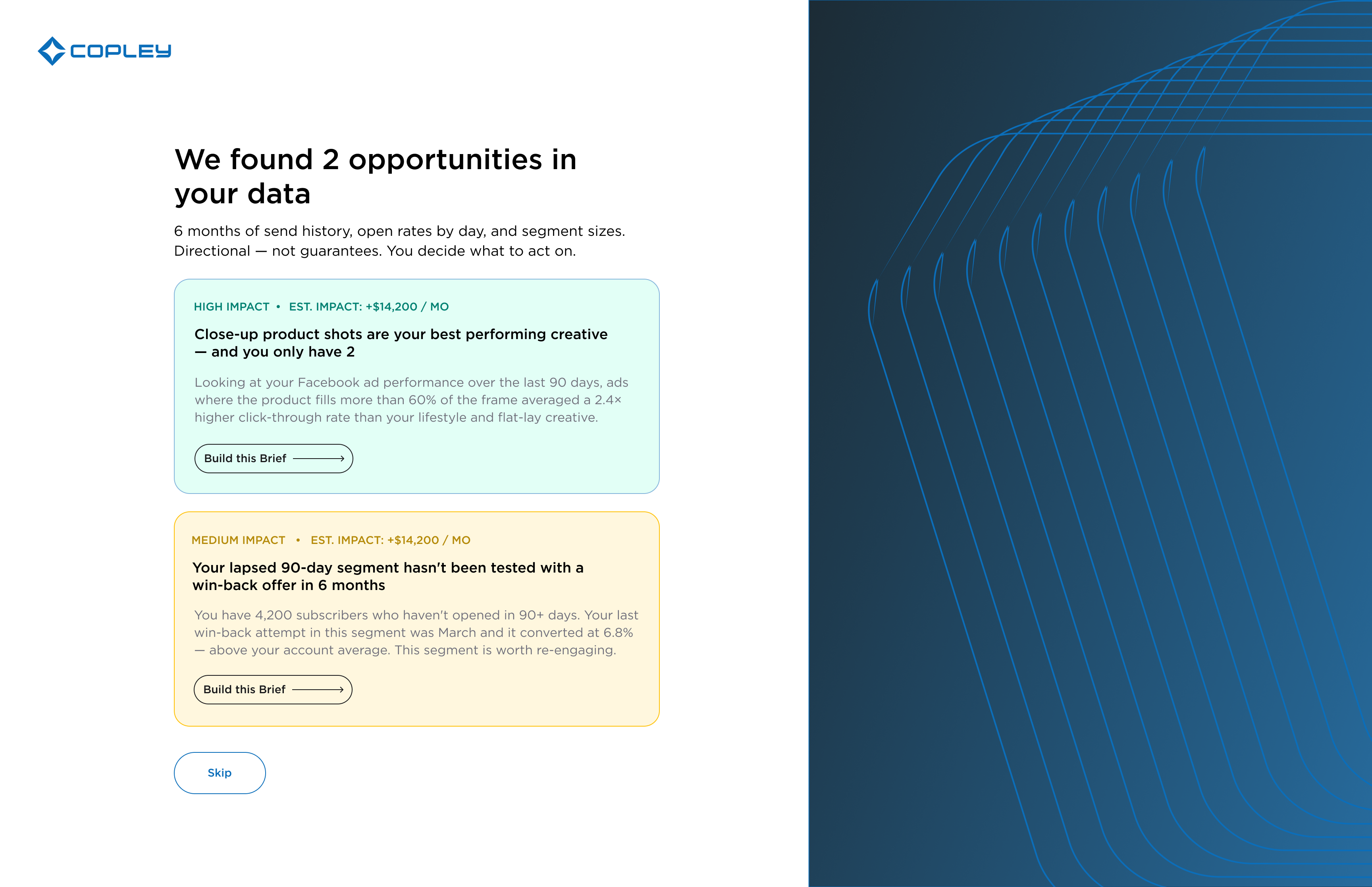
I redesigned the end of the flow so that once a user connects their integrations, Copley immediately pulls their past ad data and surfaces real opportunities before they ever see the dashboard. The first thing a new user encounters isn't an empty state — it's a personalized insight from their own account. Onboarding stops being a form and starts being a first impression of what the product can actually do.
Decision 02 — The FTUE Brief Agent
The existing brief agent was built for power users — it opened cold and asked a series of configuration questions before generating anything. For a first-timer, that's a blank-page problem disguised as a feature.
I designed a parallel FTUE agent with a completely different interaction model: show → confirm → generate. Copley opens pre-seeded with the user's specific insight. The agent proposes a creative direction — the user approves or reacts. Four exchanges, all chip-based. No typing required, no prior knowledge needed.
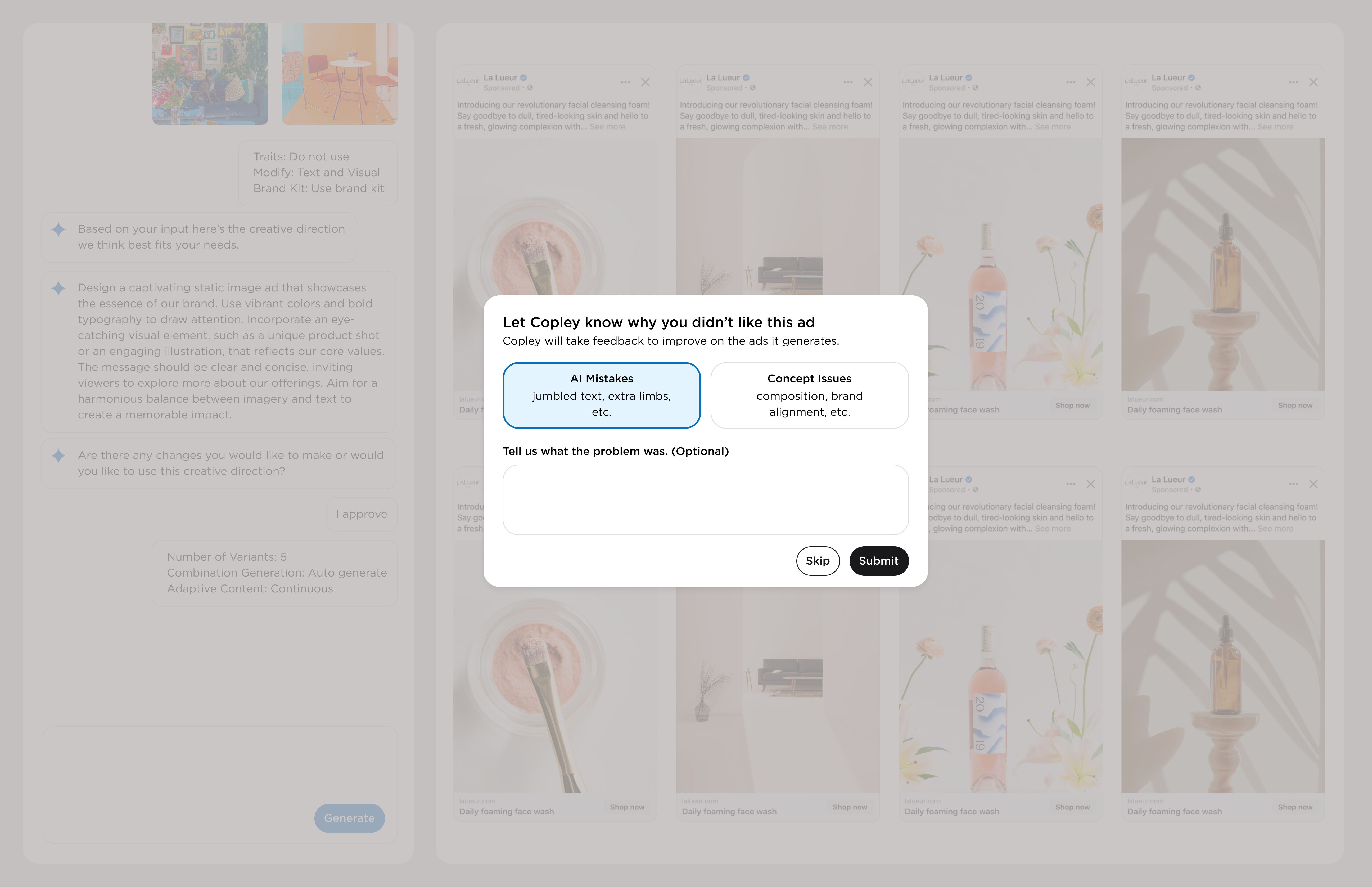
Decision 03 — Dismissal Feedback
AI-generated ads won't always be perfect. Pretending otherwise erodes trust faster than bad output does. The question was: how do you turn a bad ad into a trust moment?
When a user dismisses a variant, a small message appears in the agent panel: “Not quite right — I'll use that to refine the next one.” The replacement appears in the same slot. The first time it happens, the agent explains it. After that, it's silent. The system learns visibly, in real time, from the user's own judgment.
Creative direction
Teaching the agent to speak like a strategist.
Voice & Language
One of the more unexpected parts of this project was realizing that the copy the agent produced mattered as much as the UI surrounding it. If the agent sounds like a chatbot, users disengage. If it sounds like a senior creative strategist who's looked at their account, they lean in.
I designed a trait-based insight system where Copley surfaces specific creative opportunities rooted in actual performance data. The copy pattern: name the pattern, show the number, explain the implication, offer an action.
Language Audit
I ran a full language audit across the product. Words like “AI,” “automate,” and “machine learning” consistently triggered skepticism. Replacing them with outcome-oriented verbs — “surfaces,” “flags,” “highlights” — reduced perceived threat without changing what the product actually does.
Future states
Where this goes next.
Future States
Trait-based creative intelligence
Copley learns each brand's top-performing creative patterns over time and surfaces them proactively — not just at onboarding but throughout the brief agent flow.
Graduated trust system
As users build history with the product, the FTUE agent retires and the power agent takes over — surfacing only the configuration options each user has previously engaged with.
Dismissal feedback at scale
Aggregate dismissal patterns across accounts to improve generation quality for entire creative categories — model-level learning from real creative feedback.
Designing for AI-hesitant users forced me to think about trust as a design material — something you build deliberately through sequencing, language, and what you choose to show or hide at each moment. The instinct when working on an AI product is to explain the AI. I learned that the opposite works better: let users experience the output first, and trust follows from seeing it work.
The dismissal feedback loop is technically a simple regeneration trigger. But positioned as “your judgment is improving the system,” it transforms the same interaction from cleanup into collaboration. That reframe changed everything about how the feature feels — without changing what it does.